What Georgia law actually requires for boat registration fonts
Georgia boat registration numbers must be in block letters at least 3 inches tall, with a space or hyphen separating the letter and number groups. A correctly formatted Georgia number looks like GA 3717 ZW or GA-3717-ZW. That format is not optional.
Here is what the law requires at a glance:
- Minimum height: 3 inches for every character
- Style: Block letters only, no cursive or decorative fonts
- Spacing: A space or hyphen between the state prefix, number group, and letter suffix
- Color: Must contrast clearly with the hull background
- Placement: Forward half of the vessel, on both sides, reading left to right
These rules exist for one reason: law enforcement needs to read your number quickly, from a moving boat, at a distance. Block fonts make that possible. Anything else creates ambiguity, and ambiguity gets you cited.
Georgia's specific rules and how they fit US-wide standards
Georgia follows the same core framework as most other states, so if you understand Georgia's requirements, you understand roughly 90% of what any US state will ask for.
- Block style is mandatory. Georgia DNR specifies block lettering. Thin, condensed, or stylized characters do not meet the standard.
- 3-inch minimum height applies to every letter and number in the registration sequence.
- Spacing or hyphenation between groups is required. Running the characters together (GA3717ZW) is a violation.
- Color contrast must be clear. Low contrast fails inspection, whether that means black lettering on a dark navy hull or white on a cream-colored fiberglass deck.
- Validation decals go within six inches of the registration number, typically aft of it.
For a full breakdown of registration number size rules across states, the requirements are consistent on height but vary slightly on decal placement. Always verify with Georgia DNR if you have a non-standard hull shape.
Which fonts actually comply, and what works for boat names
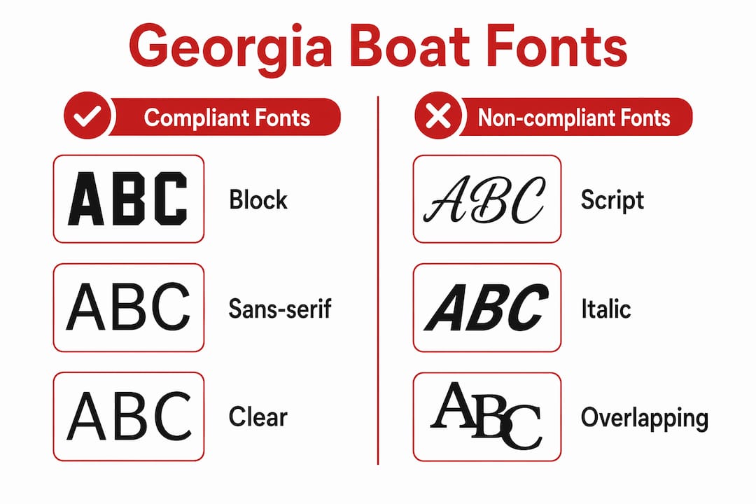
The font question trips up a lot of boat owners because the rules for registration numbers and boat names are completely different.

For registration numbers, the compliant choices are thick, clean block fonts. Arial Black and Impact are the most commonly cited examples. Both have heavy strokes, clear letterforms, and no decorative elements that could blur at distance. Bebas Neue is another option used in marine contexts, particularly for narrow applications where space is tight.
For boat names, you have real creative latitude. The four main categories:
- Serif fonts (like Times New Roman or Georgia) read as traditional and formal. Good fit for classic cruisers or sailboats.
- Sans-serif fonts (like Helvetica or Arial) feel clean and modern. They suit newer builds with sleek lines.
- Script fonts add a handwritten, personal quality. They work on boats with softer or more romantic names.
- Display fonts are bold and dramatic. Used well, they make a name memorable. The rule: legible from several boat lengths away, or don't use them.
One thing worth knowing: the wrong font can undercut your boat's whole aesthetic. A modern center console with a heavy gothic script looks confused. A classic wooden sailboat with a sterile sans-serif loses its character. Font choice shapes perception more than most owners realize.
Pro Tip: Keep boat name fonts to two at most. One for the name, one for the hailing port if you display it. More than that and the hull starts to look cluttered.
How to display registration numbers correctly on your vessel
Placement is as regulated as the font itself. Georgia requires the number on the forward half of the hull, on both the port and starboard sides, reading from left to right and oriented horizontally.
A few practical rules for application:
- Surface prep matters. Clean the hull thoroughly before applying any decal. Wax, salt residue, or oxidation will cause edges to lift within months.
- Smooth surfaces hold longer. Textured or non-skid surfaces are harder to adhere to and may require paint instead of vinyl.
- Both sides required. Registration numbers must appear on both sides of the bow area, not just the starboard side.
- No obstructions. Numbers cannot be covered by anchor lines, fenders, or equipment when the vessel is underway.
- Orientation stays upright. Angled or vertical placement is a violation regardless of hull shape.
Maintenance is straightforward but often neglected. Rinse the number area with fresh water after saltwater use. Inspect edges annually for lifting or cracking. A decal that is peeling at the corners is technically non-compliant because the character shapes become distorted.
Pro Tip: Marine-grade vinyl decals applied to a properly cleaned hull will outlast paint in most Georgia freshwater and coastal environments. UV degradation is the main enemy, not water.

Choosing the right decal material for Georgia's marine conditions
Georgia boaters deal with a mix of freshwater lakes, tidal rivers, and coastal saltwater. That range puts real stress on decal materials.
- Marine-grade vinyl is the standard for a reason. It resists UV fading, saltwater corrosion, and the thermal cycling that Georgia summers produce.
- Color selection affects compliance. White numbers on a white hull, or black on dark gray, will fail a contrast check. Choose colors that create an obvious visual separation.
- Outline and shadow effects can boost contrast without changing the base color. A white number with a black outline reads clearly on almost any hull color.
- Production quality varies. Thin vinyl cuts corners on thickness and UV inhibitors. The difference shows up in year two or three, when cheaper decals start chalking or cracking.
Registrationdecals uses marine-grade vinyl that is UV-safe and saltwater-proof, with an online design tool that lets you preview your number, font, and color before ordering. Production runs 3–5 business days, with free shipping across the contiguous US. For Georgia boat owners who want to get compliant fast without guessing at font choices, that combination of preview and quick turnaround removes most of the friction.
Fonts and styles that will get you cited
Cursive fonts are not allowed for registration numbers. That covers calligraphy styles, script fonts, and anything that connects letters in a flowing, handwritten manner. The reason is simple: a cursive "G" and a cursive "C" look nearly identical at 50 feet.
Other styles that fail compliance:
- Thin or light-weight fonts. Strokes that are too narrow disappear at distance, especially in low light.
- Condensed fonts without adequate stroke weight. Narrow fonts like Bebas work for regatta bow numbers where the context is controlled, but they can fall short for registration use if the stroke is too thin.
- Outline-only fonts. A character that is just a hollow outline reads poorly from a distance and may not meet the "block letter" standard.
- Decorative or themed fonts. Pirate-style lettering, distressed fonts, or anything with texture built into the letterform is non-compliant.
- Mixed font styles. Using one font for letters and another for numbers within the same registration sequence creates inconsistency that inspectors flag.
The underlying principle: if a character could reasonably be mistaken for a different character at 30 feet, the font is wrong for registration use.
How to confirm your boat numbers will pass inspection
The most reliable method is to check directly with the Georgia Department of Natural Resources before you apply anything. Their boating regulations page specifies current requirements, and a quick call to a local DNR office can confirm whether your specific hull configuration or color combination raises any questions.
Beyond that, a few practical checks:
- Step back 30 feet and look at your numbers. If you have to squint or guess at any character, the font or contrast is insufficient.
- Photograph the numbers in direct sunlight and in shade. Contrast problems often show up in photos that look fine to the naked eye at close range.
- Check the decal regulations for your state before ordering. Requirements can update, and a resource that covers all 50 states helps you verify Georgia's current rules quickly.
- Ask during your next vessel safety check. US Coast Guard Auxiliary and state DNR officers conduct free vessel safety checks. They will flag non-compliant numbers on the spot, before you face a fine on the water.
If you are unsure whether your current font qualifies as block style, the safest move is to replace it with a known-compliant option like Arial Black before your next time on the water.
Key Takeaways
Georgia boat registration numbers must use block-style fonts at least 3 inches tall, with clear color contrast and proper spacing, to meet state law and pass inspection.
| Point | Details |
|---|---|
| Minimum font height | Every character in the registration number must be at least 3 inches tall. |
| Block style only | Fonts like Arial Black and Impact comply; cursive and decorative styles do not. |
| Spacing requirement | A space or hyphen must separate the state prefix, number group, and letter suffix. |
| Color contrast | Low contrast between the number and hull color fails inspection regardless of font. |
| Material choice | Marine-grade UV-safe vinyl holds up in Georgia's freshwater and saltwater conditions. |