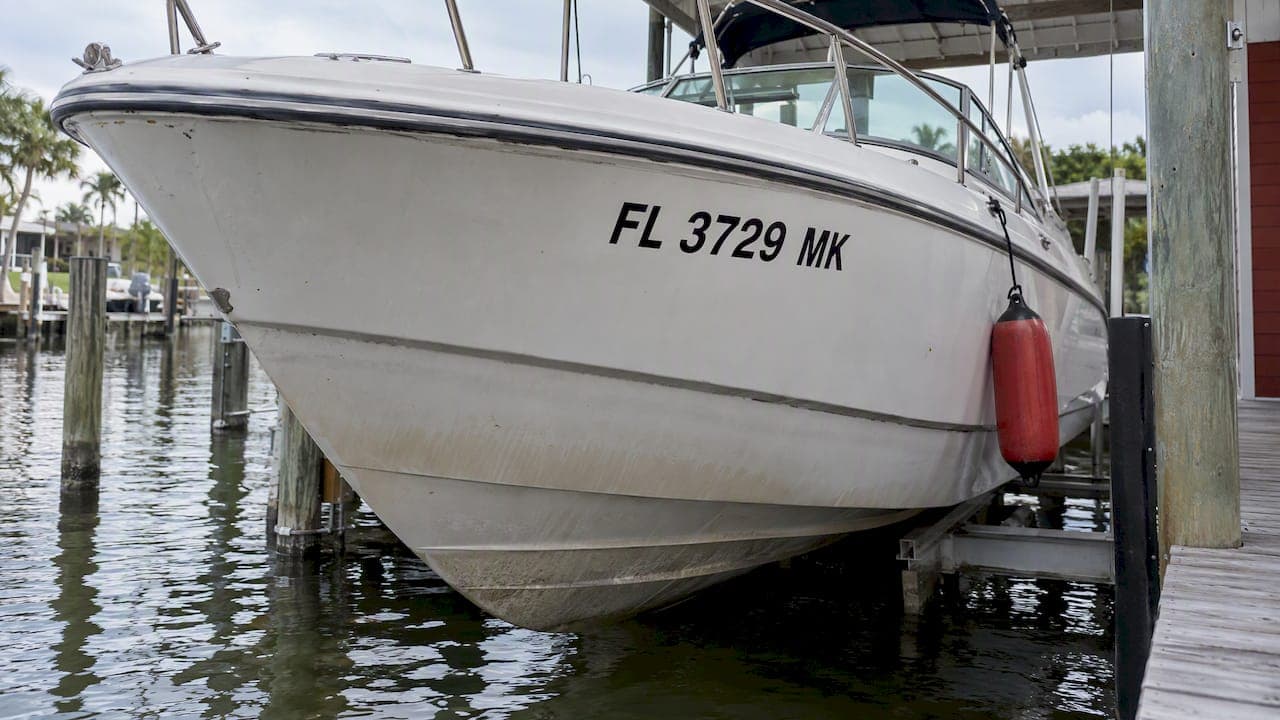
No federal rule gives a stroke width for boat registration numbers. What the law does require is plain vertical block characters, at least 3 inches high, in a color that contrasts with the hull and is distinctly visible and legible. Stroke width is the one part you choose yourself, and it decides whether your numbers read as bold, clear block characters or as thin, hard-to-read ones. This guide covers what is regulated, what is left to you, and how to pick a width that holds up on a real hull.
TL;DR
- Federal rules (33 CFR 173.27) set a minimum height of 3 inches and require plain vertical block characters. They do not state a stroke width or a width-to-height ratio.
- Because the rule says "distinctly visible and legible," a stroke that is too thin can fail an inspection even when the height is right.
- Borders, outlines and shading do not count toward height in at least some states, so measure the character itself.
- Choose a stroke that looks solid from the distance an officer would approach, and favor strong contrast over decoration.
- Your state may add its own rules. Check with your state boating agency before ordering.
Table of Contents
- What federal law says about stroke width
- Why height is what gets checked
- What "plain vertical block characters" means for stroke
- How to choose a stroke width that stays readable
- A quick reference for choosing
- Spacing and placement affect how thick the numbers look
- Hull shape changes what stroke looks right
- Why the material matters as much as the width
- Our perspective
- Order decals made for your boat
- Check your state before you order
- FAQ
- Sources
What federal law says about stroke width
The regulation that governs recreational boat numbers is 33 CFR 173.27. It requires that registration numbers be plain vertical block characters, at least 3 inches high, in a color that contrasts with the background, and distinctly visible and legible. It also requires that the numbers be painted on or permanently attached to each side of the forward half of the vessel, reading from left to right.
What the text does not contain is a stroke width, a line thickness or a ratio of thickness to height. If you came here looking for a number such as "half an inch," you will not find one in the federal rule. Anyone quoting a precise federal stroke width is adding to the regulation.
That gap is easy to misread in two directions:
- "There is no rule, so anything goes." Not so. The requirement that characters be plain block style, distinctly visible and legible applies to every stroke you draw. A hairline font fails the spirit of the rule, even if each character is tall enough.
- "There must be a hidden number." There is not. Officers judge the result: can the numbers be read, and are they block characters at the required height?
The U.S. Coast Guard's 2023 Boater's Guide to the federal requirements repeats the same minimum of 3-inch characters, contrasting color and legibility, and tells owners to check their state boating authority for additional requirements.
Why height is what gets checked
Height is the only dimension the federal rule measures, so it is the one that matters most when someone checks your boat. Our guide on how tall boat registration numbers need to be walks through the measurement, and the details are worth knowing before you think about stroke at all.
California's Department of Parks and Recreation, in its registration guidance, states that letters and numerals must be block characters at least 3 inches high. It also says borders, trim, outlining and shading do not count toward the required height. That matters for stroke width in a practical way: a decal with a thin number and a thick decorative outline might look 3 inches tall overall, yet the character itself falls short.
Measure from the top of the character to the bottom of the character, not from the edge of an outline. If you want the details of passing a tape-measure check, our block letter guide and our number design checklist cover it.

What "plain vertical block characters" means for stroke
The phrase "plain vertical block" has three practical consequences for the stroke:
- Plain: no script, no slant, no decorative flourishes. Hawaii's boating division advises avoiding slanted or script numbers, which do not meet U.S. Coast Guard standards.
- Vertical: characters stand upright. Italic or oblique styles are out.
- Block: strokes are solid and fairly uniform, with the counters (the holes in 8, 6, 9, 0) open enough to read.
A block face has strokes of consistent thickness. If one part of a character is far thinner than another, as in some stylized or high-contrast fonts, it stops being a plain block character. For more on typefaces, see what font is required for boat registration numbers and whether numbers have to be block letters.
How to choose a stroke width that stays readable
Because no regulation fixes the stroke, you are choosing for legibility. Here is the reasoning we use, offered as practical judgment rather than a legal standard.
Start from the character, not the line
Pick a font that is a true block face first. In a well-made block font, the designer has already balanced stroke against height and character width. Stretching or squeezing a font to change its stroke usually distorts it. If you need a bolder look, choose a bolder weight of the same plain block style rather than adding an outline.
Think about the distance
A 3-inch character on a boat that is moving, or seen from another boat across water, is small. Thin strokes disappear first: light reflecting off the hull, spray, a dusty or weathered surface and glare all eat into narrow lines. A sturdier stroke keeps a character's shape when the details blur. That is why we lean toward medium to bold strokes for anything the minimum height, and why many owners go taller than 3 inches when the hull allows.
Check the counters and gaps
A stroke that is too heavy closes up the inside of an 8 or a 6 and the gaps in a 3 or 5. A stroke that is too thin looks fragile. The right weight is the one where each digit is clearly a digit and the gaps between strokes are visible without squinting. Print a test at full size, tape it to the hull, and walk 30 feet away.
Keep contrast the priority
Stroke width and color work together. A bold stroke in a poorly contrasting color is still hard to read, and a perfect color in a skinny stroke is the same. California's guidance directs owners to choose strong contrast. Dark characters on a light hull and light characters on a dark hull are the standard approach. Read more in what color boat registration numbers have to be.
A quick reference for choosing
The table separates what the rule states from what is a judgment call.
| Feature | Required by federal rule? | What to do |
|---|---|---|
| Character height | Yes, at least 3 inches | Measure the character itself, excluding outlines and shading |
| Plain vertical block style | Yes | Use an upright block font, no script or slant |
| Contrast with the hull | Yes | Dark on light or light on dark |
| Distinctly visible and legible | Yes | Test at a distance, in daylight, on the actual hull |
| Stroke width or ratio | No figure given | Choose a medium to bold, uniform stroke |
| Outlines, borders, shading | Not required | Skip them, or keep them from counting toward height |
Spacing and placement affect how thick the numbers look
Stroke width does not work alone. Numbers with wide gaps and a moderate stroke look lighter than the same numbers packed tightly, and groups run together when the spaces are wrong.
Federal rules require spacing between the letter and number groups equal to the width of a letter or number other than I or 1, or a hyphen of the same width. Our page on how much space goes between boat registration numbers shows how to lay it out.
For placement, the numbers must be on both sides of the forward half of the hull and read left to right. See where boat registration numbers go and whether they go on both sides. Hawaii also notes that no other numerals, letters or devices may be placed near the vessel number, so keep the area around your characters clear.
Validation stickers sit separately from the numbers. Washington's licensing department says decals go on both sides of the bow within 6 inches of the registration number, as set out on its boat registration page. Our guide to where the validation sticker goes covers the general approach.

Hull shape changes what stroke looks right
A flat aluminum hull gives you a clean, even surface, and a medium-bold stroke reads well. A flared bow, a common feature on center consoles and many fiberglass boats, bends the surface so the characters look narrower from the side. California tells owners to relocate numbers if a flared bow makes them difficult to read. In practice, this means:
- Put the numbers on the flattest part of the forward half of the hull.
- If the surface curves sharply, a bolder stroke helps the characters keep their shape when seen at an angle.
- Pontoon boats have rail panels and gates that suit a different layout. See pontoon number placement.
- Personal watercraft have little room, so character choice matters more. Our page on whether jet skis need registration numbers explains the rules for those.
If you own a kayak or canoe, check whether kayaks and canoes need registration numbers first, since many are exempt.
Why the material matters as much as the width
A good stroke width is wasted if the decal fades or peels. Sun and salt take a toll on cheap vinyl, and a faded number loses contrast, which brings back the legibility problem. Marine-grade vinyl is built to resist UV exposure and saltwater. You can read more in how long marine vinyl decals last.
Painted numbers can work too, but a decal gives you a repeatable, uniform stroke without the risk of uneven brush lines, a particular problem with thin or hand-drawn characters.
Our perspective
We make registration decals, and the stroke question comes up more than you would expect, usually from owners who have been told two different things by two different people. Here is how we think about it.
The regulation sets the floor on height, style and contrast, and it leaves the stroke to judgment. We do not think that is a loophole. It is a prompt to design for the person who has to read your boat: an officer, a marina attendant, a rescue crew. We would rather you have a clean, solid block character than a technically tall but spindly one.
Three habits will save you trouble:
- Measure the character, not the decoration around it.
- Choose a plain block face and resist stretching it.
- Confirm your state's rules before you order, because states can add requirements to the federal ones.
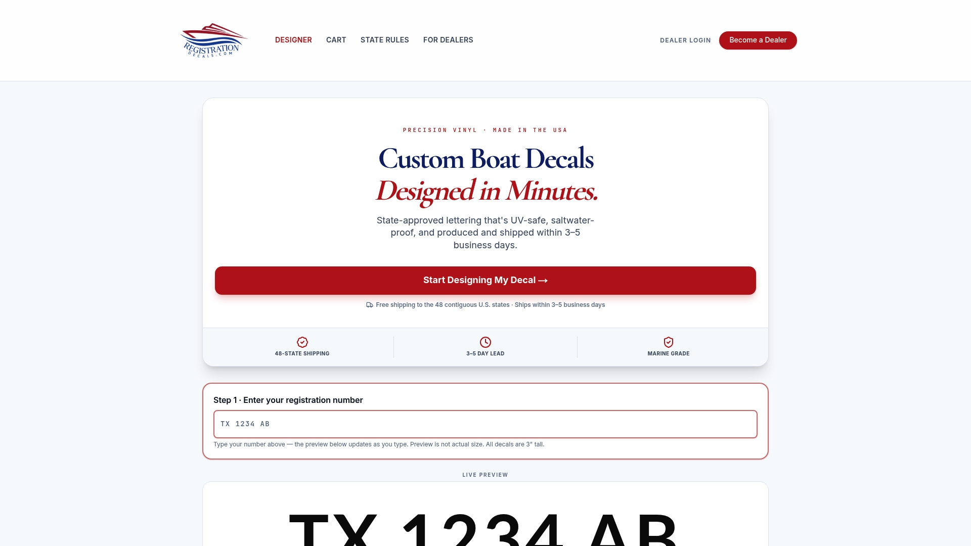
Our online design tool lets you enter your registration number, then choose colors and fonts, and see the result before you order, so you can judge the stroke on screen before anything is cut. Our own guidance on state compliance is on the site, and we work from the federal rules and the state agencies' published rules.
— Taylor
Order decals made for your boat
If you want numbers that meet the 3-inch block requirement and stay legible, our custom boat registration numbers and decals are made in-house from marine-grade vinyl that resists UV and saltwater. You enter your number, pick the colors and font, and place the order. Production takes 3 to 5 business days, and shipping is free in the contiguous United States. A set is $35.99.
We also have pages for specific boat types: jet ski numbers, pontoon numbers, bass boat numbers, aluminum boat numbers and center console numbers. Marinas and dealerships can order in bulk.
Check your state before you order
Federal law sets the minimum, and states can add to it. The Coast Guard's boater's guide says owners may need to comply with additional laws specific to the state where the boat is registered or operated, and it points to NASBLA's list of state boating agency contacts. Some examples from this article show how states differ in detail: Washington specifies where decals sit, Hawaii warns against anything near the number, and California excludes outlines and shading from the height measurement.
Before ordering, take these steps:
- Look up your state's boating agency and read its numbering page.
- Note any rules on prefixes, spacing, hyphens and decal placement.
- Confirm the character height, and whether the state states a preferred style.
- Check the current rules again if you move the boat to a new state or registry.
FAQ
Is there a required stroke width for boat registration numbers?
No federal figure exists. 33 CFR 173.27 requires plain vertical block characters at least 3 inches high that are distinctly visible and legible, but it does not state a line thickness or ratio. Check your state's rules in case it adds detail.
Can I use a thin font if the characters are 3 inches tall?
It is risky. The characters must be plain block style and legible, and a thin or stylized font may not meet that standard even at the right height. A uniform, medium to bold block font is the safer choice.
Do outlines or shadows make the numbers count as taller?
No, at least not in California, where the state says borders, trim, outlining and shading do not count toward the required height. Measure only the character itself, and keep any decoration minimal.
Should my numbers be bigger than 3 inches?
Three inches is the minimum, and going taller is fine when your hull has room and your state does not limit it. Bigger characters with a solid stroke are easier to read from a distance.
Where do I confirm my state's rules?
Contact your state boating agency. The Coast Guard's guide points owners to NASBLA's list of state boating agency contacts for state-specific requirements.
Sources
- eCFR: 33 CFR 173.27, Numbers: Display; size; color
- U.S. Coast Guard: A Boater's Guide to the Federal Requirements for Recreational Boats (2023)
- California Division of Boating and Waterways: Registration (2016)
- Hawaii Division of Boating and Ocean Recreation: Numbering Your Vessel
- Washington Department of Licensing: Boat registration and hull identification numbers